MANY STYLES,
ONE SIGNATURE
Here’s what I’ve been up to lately
I’ve designed and developed over 100 websites and web applications, always guided by clarity, aesthetics and purpose. From emerging startups to established brands, I turn ideas into strong visual identities and thoughtful products.
My work also extends beyond the screen — from branding and print to illustration and motion. But whether on or off-screen, everything I do is rooted in a strong, consistent visual language.
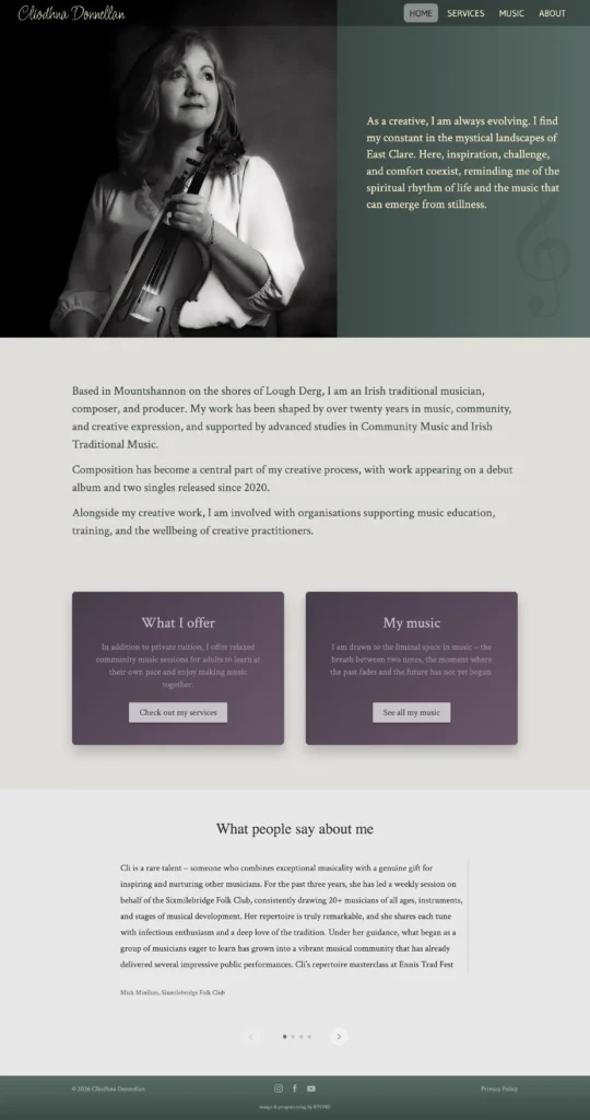
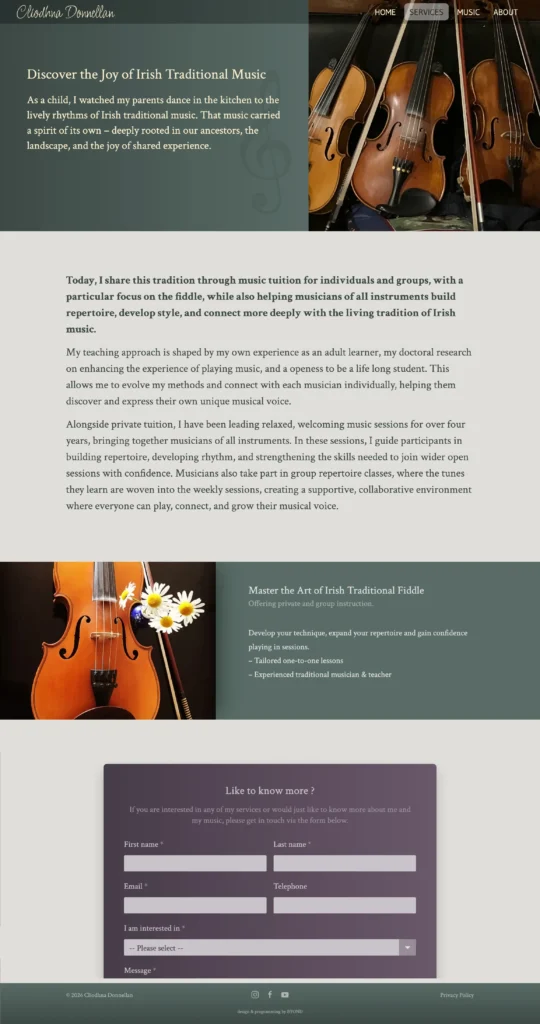
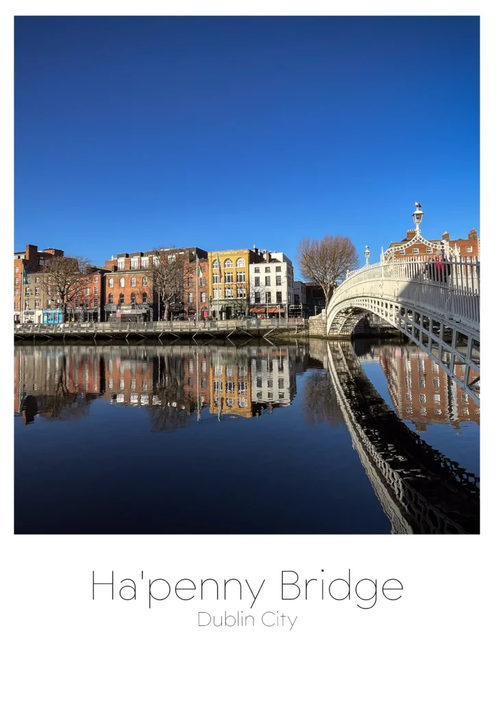
Cliodhna Donnellan
Based in Mountshannon on the shores of Lough Derg, Clíodhna Donnellan is an Irish traditional musician, composer and producer.
Designing and programming her website was a truly creative process. Influenced by her connection to the landscape of East Clare, the design reflects both her individuality and her relationship with nature. Its calm aesthetic mirrors the soulful, evocative quality of the music Clíodhna plays and teaches.
berrytree
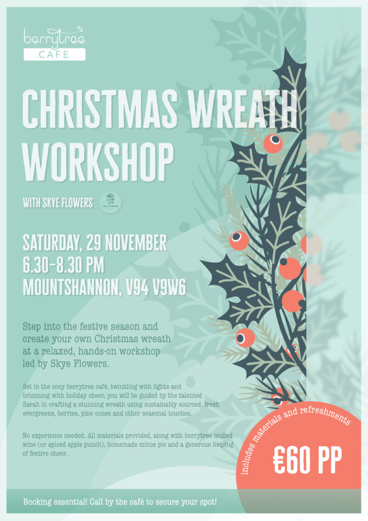
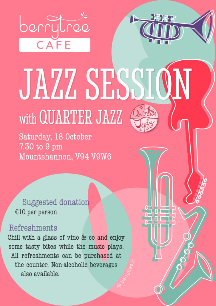
For the growing number of events at Berrytree Café, I created a series of posters. The goal was to attract attention with clear visuals and bold colours, while keeping berrytree’s characteristic style. Colour accents from the café’s existing design system help maintain consistency and create a cohesive look across all materials.
berrytree
Berrytree’s transformation from a home bakery to one of Ireland’s standout cafés happened fast, and the logo evolved right with it. Through several iterations, the identity shifted to match the business’s growth, while holding onto what makes the place special. The current mark strikes that sweet spot between elevated quality and genuine warmth, capturing both the craftsmanship and the cosy welcome that Berrytree is known for in Mountshannon.
berrytree
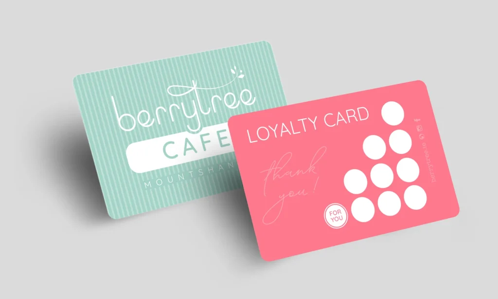
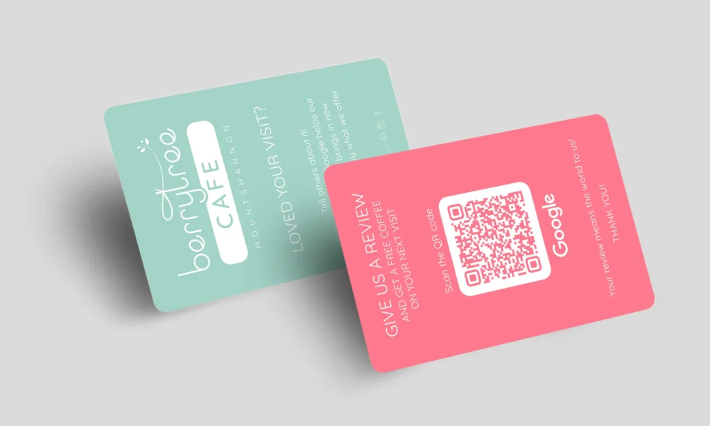
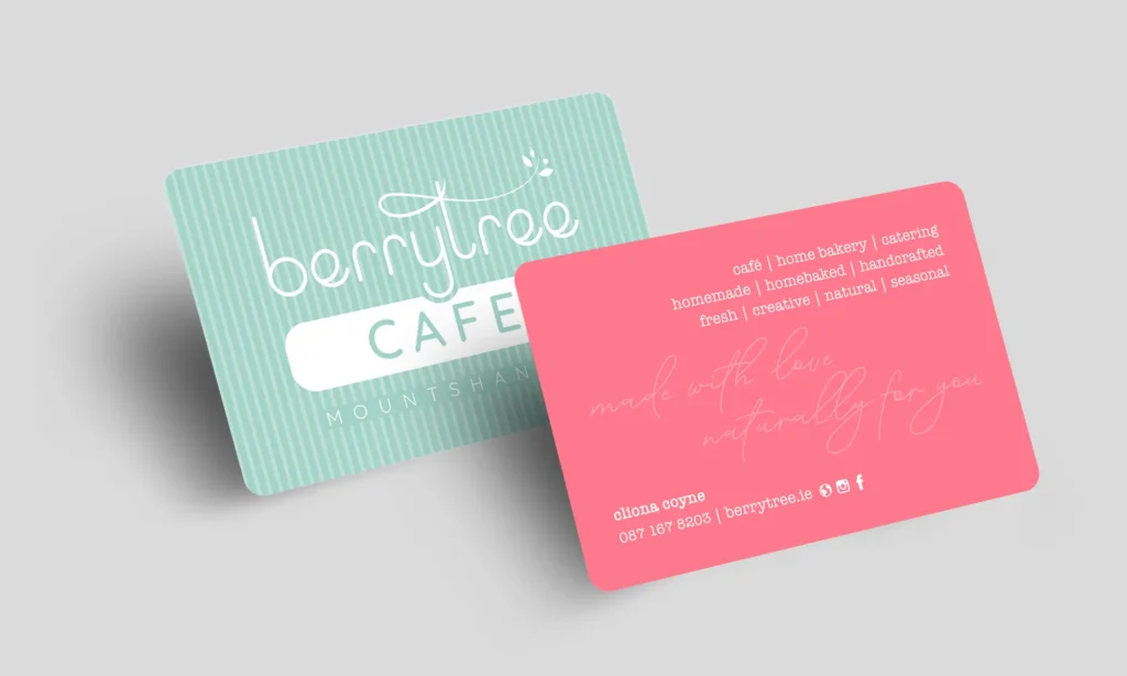
New logo, new business cards. The second iteration reflects Berrytree’s evolution from a small home bakery to a top-class café. Fresh, friendly and inviting colours that capture the unique vibe of the place.
Alongside the main business card, I also designed a loyalty card and Google review card. Each serves a clear purpose and strengthens the café’s connection with its guests.
berrytree
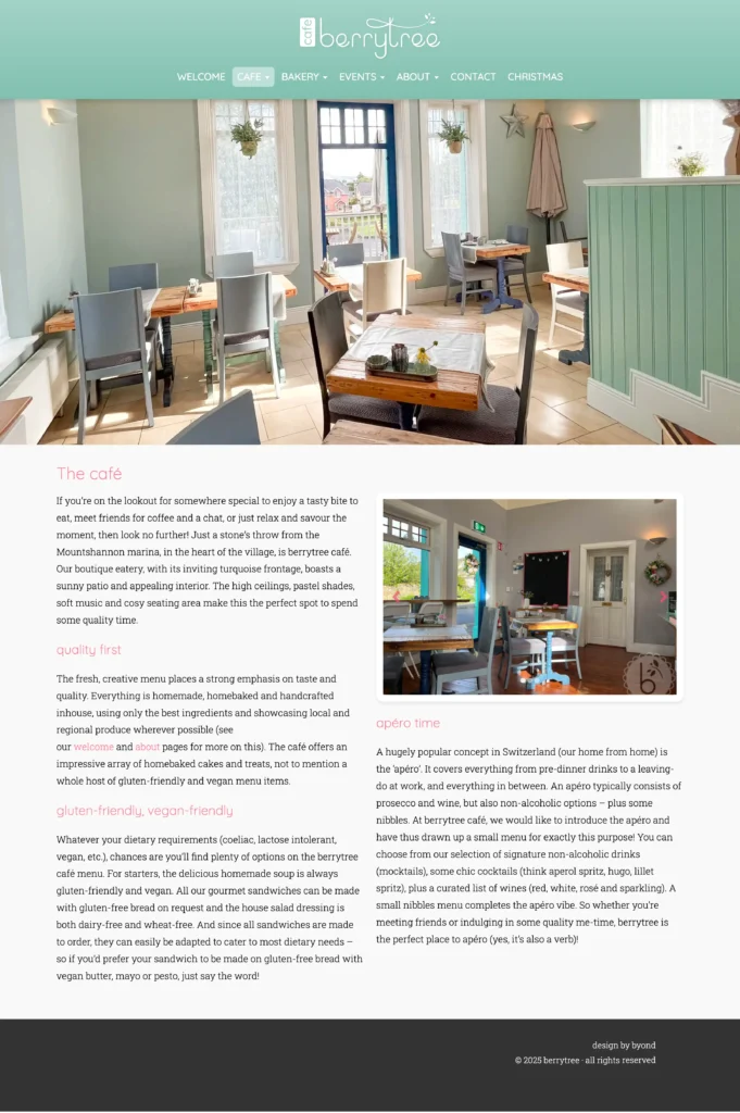
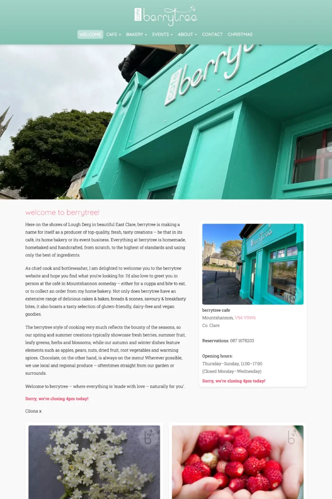
Berrytree’s website had become outdated, with an unsupported theme that no longer reflected the business’s growth and success. I developed a custom WordPress theme with bespoke page layouts, enhanced visual elements and some nifty features that align with the company’s current positioning.
Praxiszentrum Moewe
A stylised seagull (Möwe) paired with a classic typeface and muted colours. The result is a timeless logo that conveys calm and trust. Perfect for a medical practice specialising in general medicine and women’s health, where patients can feel safe and well cared for.
For Teagasc, the Irish Agriculture and Food Development Authority, I created a series of whiteboard animations on various agricultural topics. I transformed their illustrated information sheets from static PDF documents into engaging animated explainer videos.
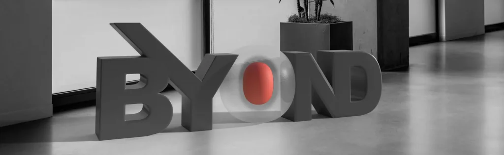
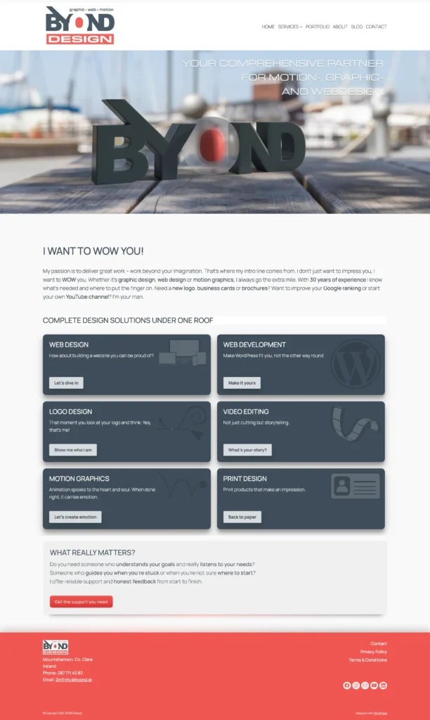
BYOND
My logo is my anchor point. My entire visual presence is built on it. I identify strongly with it, am proud of it and feel deeply connected to what it represents. It feels authentic in every aspect. The accent colour is highly versatile. I can adapt it to any colour for special occasions and it always looks good.
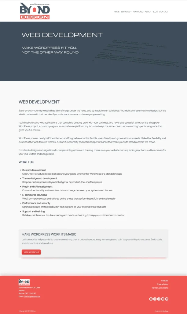
BYOND
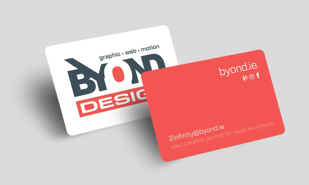
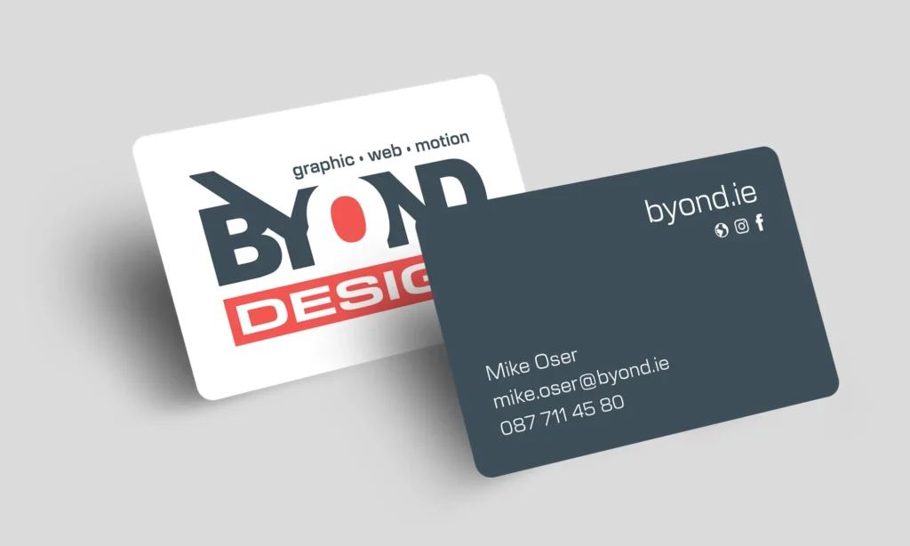
I love my business cards! They’re simple yet eye-catching. I created two versions for different situations. The ‘drop-off’ card: bold colours, cost-effective production, designed to get noticed when left behind at events or meetings. The ‘personal’ card: my name on premium paper stock; it has style and makes the right impression in one-on-one conversations. The kind of business card you actually keep.
BYOND
My own website was my hardest project. Designing a website for yourself is a unique challenge. Every detail gets questioned multiple times over, every word weighed up carefully. This same level of care goes into every client project. My website reflects what matters to me: thoughtful design that works without feeling intrusive. The best details are the ones you don’t consciously notice. But they can make all the difference.
Vacportal
Vacportal needed a logo that could hold its own in a technical industry without feeling cold or corporate. Working from the client’s original sketches, I developed a mark that’s bold and direct. The final design balances precision with movement, giving the brand a confident, contemporary presence.
Vacportal
Website updates, multilingual setup, ERP integration, product videos, SEO and lots more – Vacportal keeps me busy. In a fiercely competitive market, it’s about staying one step ahead. This kind of long-term collaboration is what makes projects exciting.
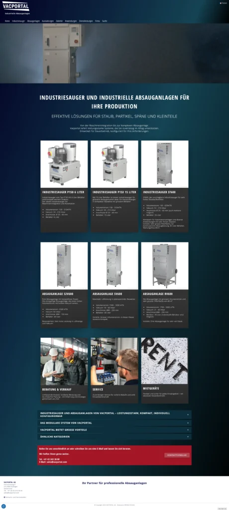
Vacportal
Product videos are an additional part of my work for Vacportal. The client sends raw footage and a script, I handle the editing: cutting, selecting moments, adding information overlays. Each video gets a custom intro. Originally shot in Swiss German, the videos are professionally dubbed in multiple languages.
Vacportal
Vacportal’s services page covers three key areas: consulting/sales, service and rental. To make them feel more approachable, we created a mascot for each section. The client provided the initial concept and rough sketches, and I took it from there, refining and illustrating three distinct characters that give the platform a friendlier, more human touch.


BookMonster
The monster in the logo was created by my daughter on the iPad with Procreate when she was 11. I adapted her drawing into a clean, streamlined mark and paired it with a playful typeface that fits the character. The colours reflect the classic blue for boys, pink for girls approach, making the brand instantly recognisable for its young audience.
BookMonster
Bookmonster started as a lockdown project when my kids were reading like crazy and wanted to share their book reviews with fellow bookworms. The channel took off, gaining some serious attention and even getting featured on national radio multiple times. Every video kicks off with a punchy intro that matches the brand’s cheeky personality: bold, playful and catchy. The channel hasn’t been active for a few years, but the intro still makes an impression from the get-go.
GsundPunkt
GsundPunkt stands for a holistic approach to health, combining physiotherapy with complementary practices. The visual identity captures this philosophy through a bold, flowing form that suggests movement, balance, and energy. A strong contrast and a distinctive silhouette create a mark that is both dynamic and unmistakable.
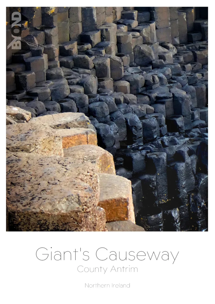
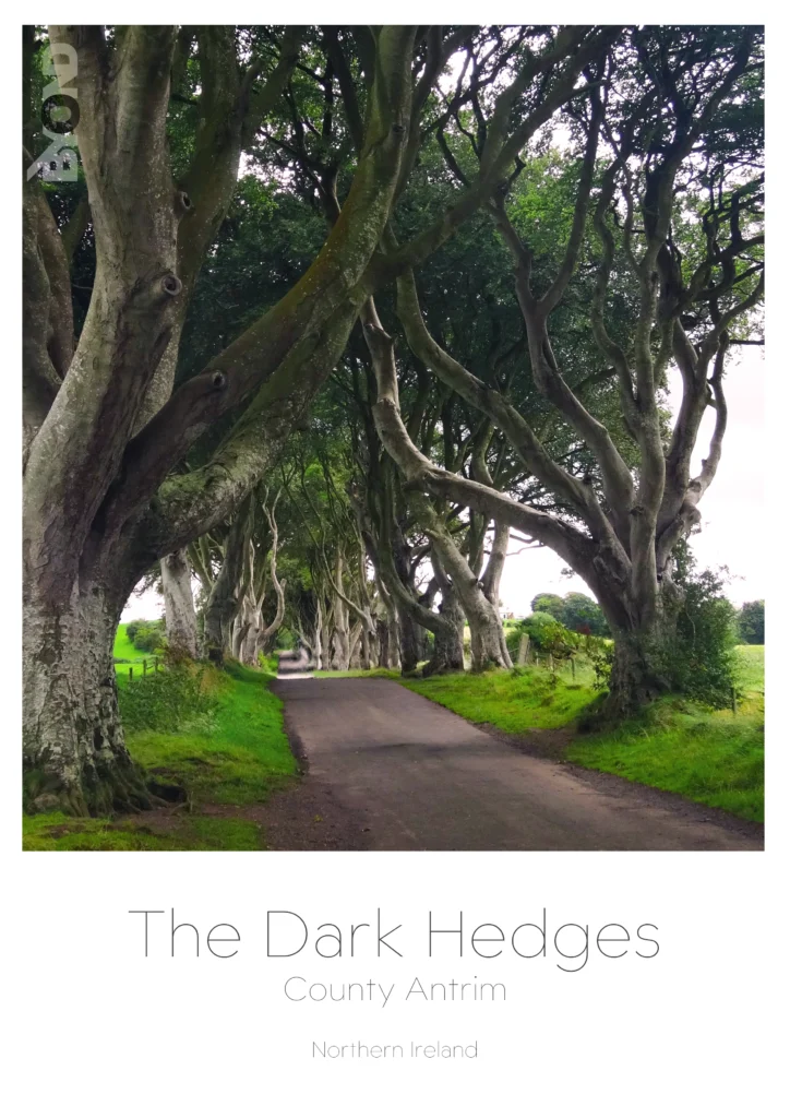
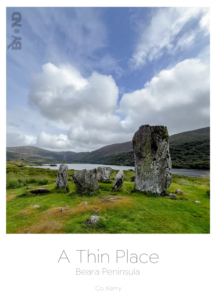
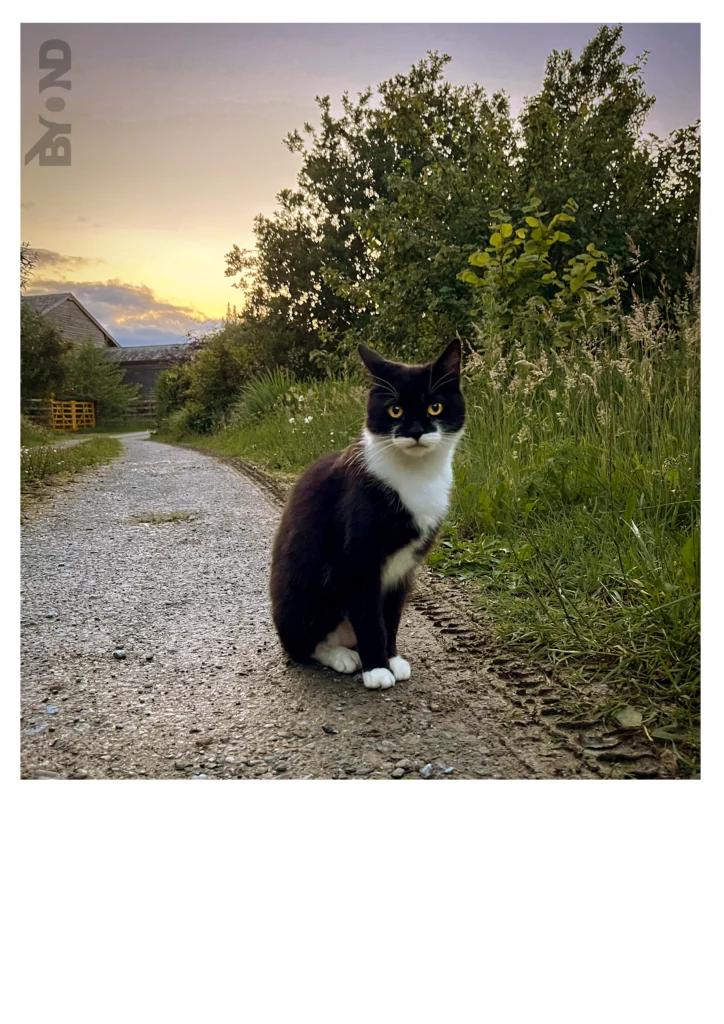
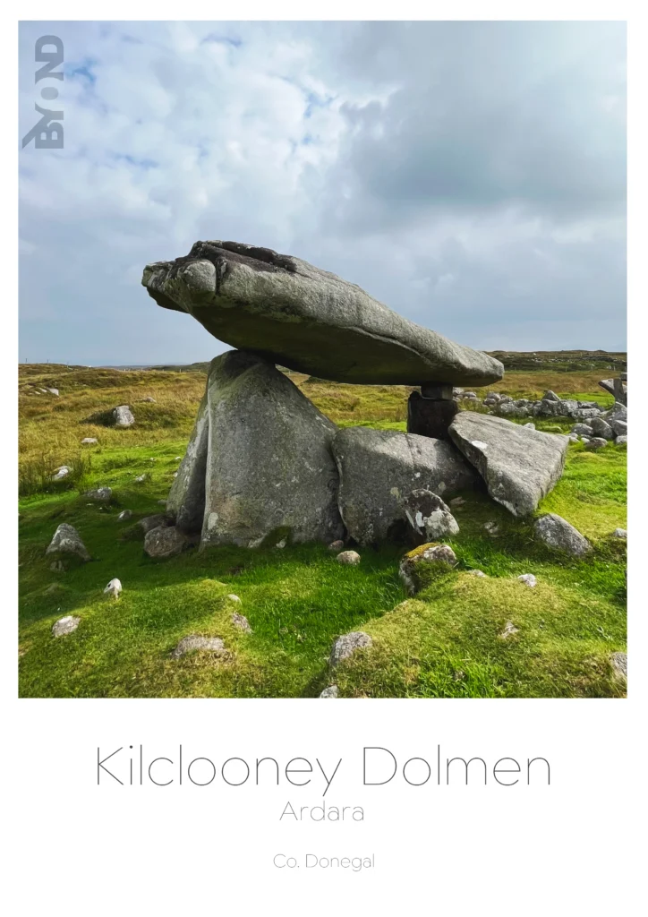
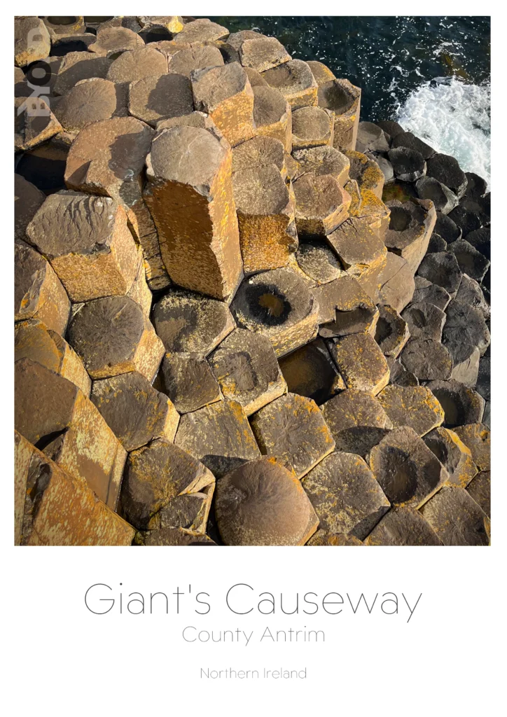
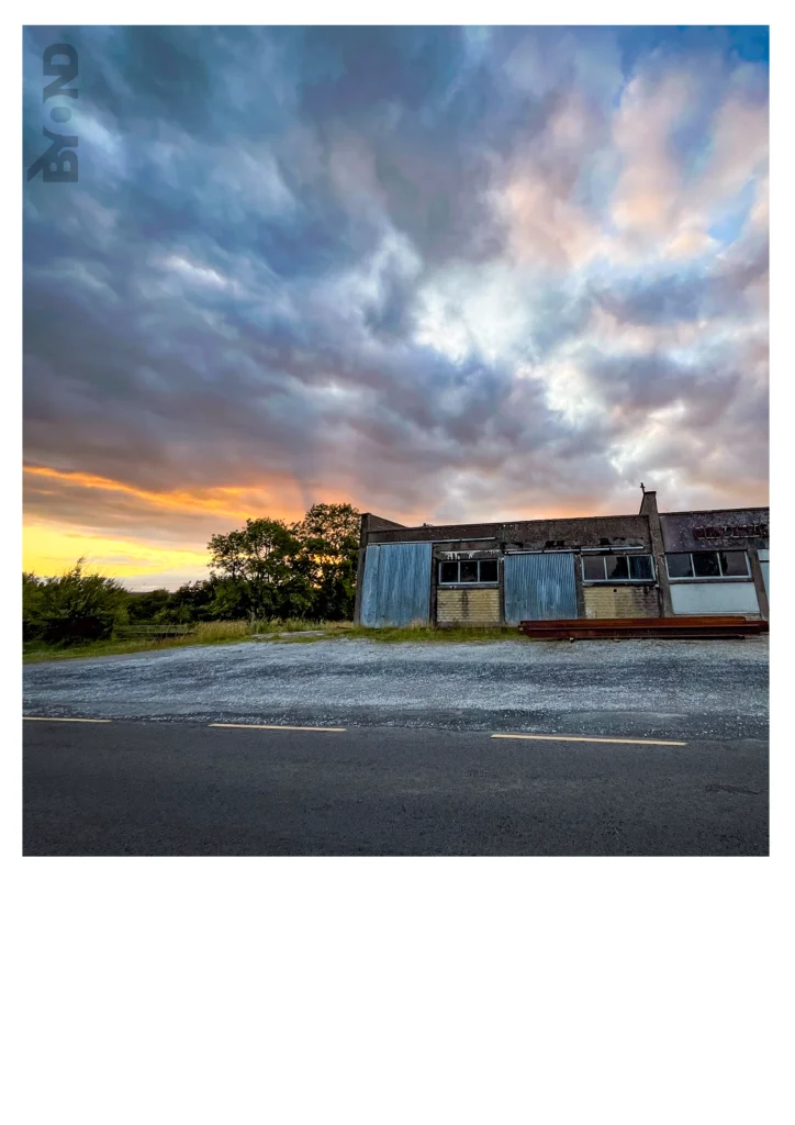
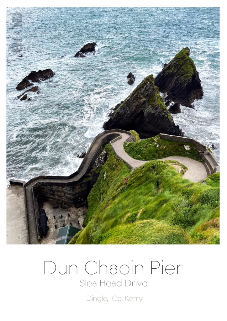
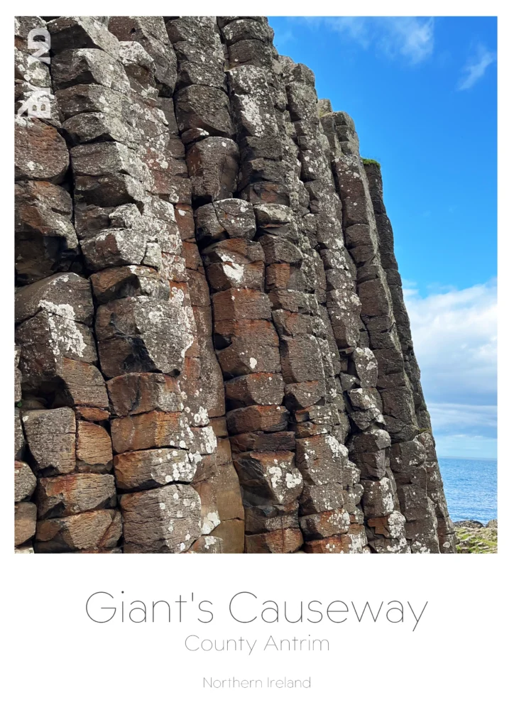
Photo retouching
I love taking photos. Years ago, I read an article about a photographer who created great shots with terrible cameras. Since then, my goal has been to take stunning photos no matter what the gear.
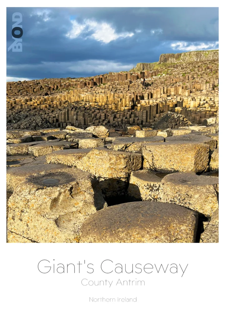
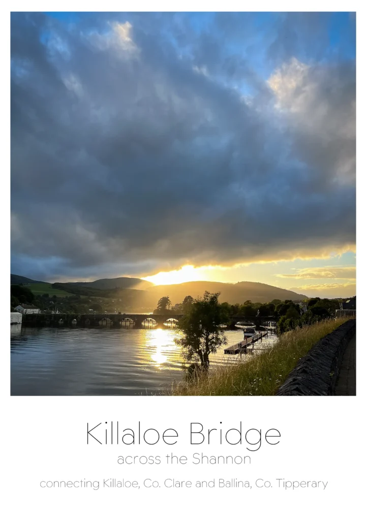
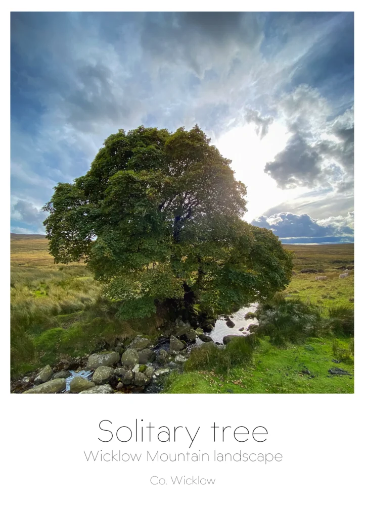
These photos were taken with one of the smallest digital compact cameras from back in 2013. The original RAW files showed flat tones and poor exposure. Through careful colour correction, contrast adjustment and selective retouching, the final images reveal much more depth and character than the originals. Click on the picture to get the before and after effect.
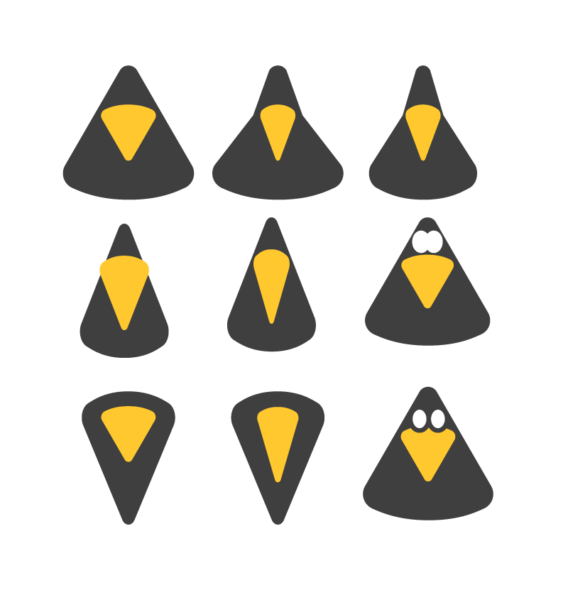
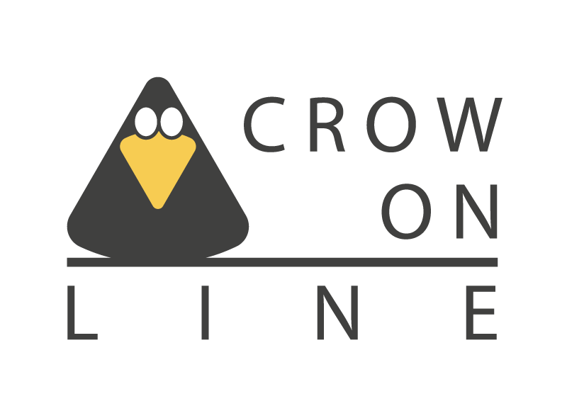
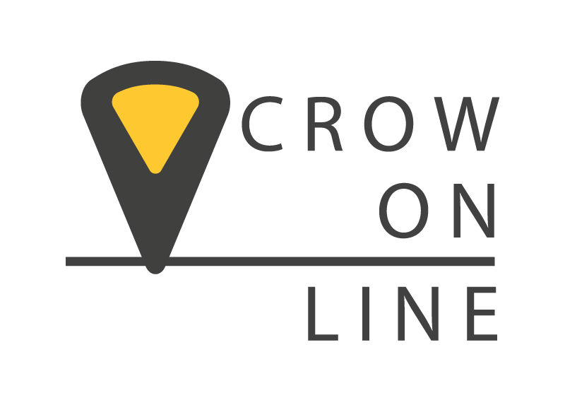
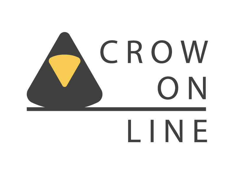
Crow On-Line
Work in progress
Cliodhna Donnellan
berrytree
berrytree
berrytree
berrytree
Praxiszentrum Moewe
Teagasc
BYOND
BYOND
BYOND
Vacportal
Vacportal
Vacportal
Vacportal
BookMonster
BookMonster
GsundPunkt
Photo retouching